Austin Macdowell
UX Systems Designer
I simplify complex backend systems to enable delightful user experiences at scale. I enjoy working with large, complex organizations who need to reach different sets of users with a single, flexible solution.
I'm best at...
UI framework development
Design system implementation
Digital accessibility
Conversation Design
Projects
Building a design-led card UI framework
Learn how I aligned a server-driven schema with a design library to enable better workflows for designers and engineers plus better performance for users.
Helping creators launch campaigns faster
Learn how I influenced the underlying structure of an internal tool to help users create and organize communications more easily.
Assuring users of backend progress
Learn how I helped assure chat users that a virtual agent was working on their task in the background.
Systematizing confirmation email content
Learn how I created a scalable & consistent approach to the information sent in confirmation emails.
Font: Inclusive Sans by Olivia King
Building a design-led card UI framework
Expedia Group / 2025
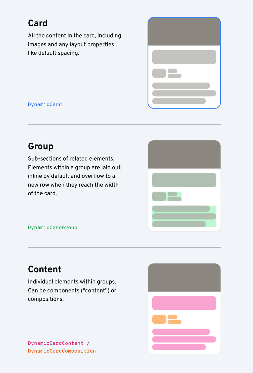
A number of teams building with the platform I help maintain utilize a framework built specifically for cards. It allows folks to send JSON payloads as part of their skills or tools that render cards in the UI. It was initially built by developers and for developers, so it’s always done a great job at enabling rapid development but over time it’s shown an obvious lack of design standards and become time-consuming and tedious to maintain. It had also started lacking in performance as payloads grew larger and larger due to a lack of guidance or cohesive set of patterns.When migrating to a new version of the framework, we wanted to come up with solutions that would balance rapid implementation and updation, ensure use of consistent design patterns, and create a more stable and scalable workflow for both design and engineering.
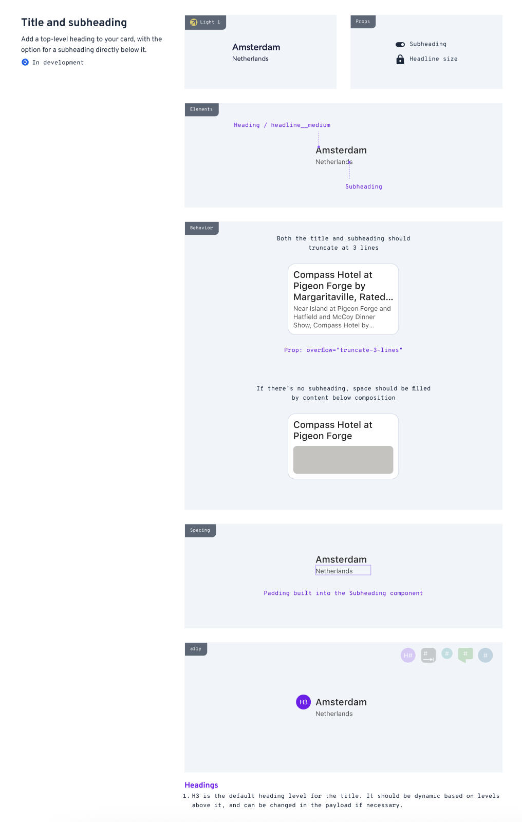
First, I partnered with the engineering team in charge of the framework to align schema elements with design intents. This included changes like adding a schema object called a “composition” which stored design decisions for common patterns in a server-side library to reduce payload sizes and codify design patterns. I built out an entire library of these patterns, ranging in size from individual components taken from the design system to entire card patterns for commonly represented entities like property highlights or a refund summary. As part of this effort, I aligned our token infrastructure for spacing, color, and text properties to the broader design system to enable scalability across 40+ brands using the framework.
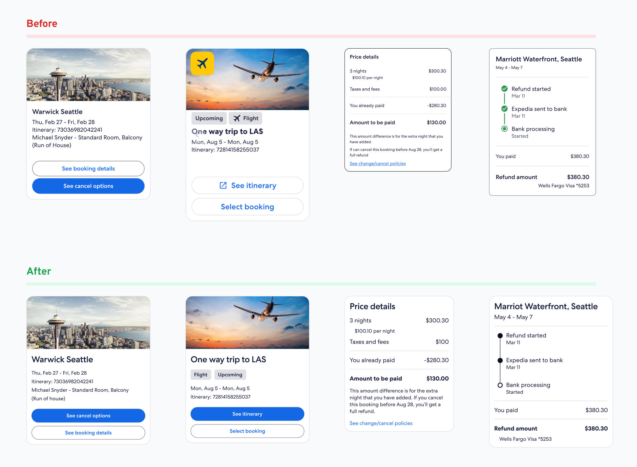
I built out the library in Figma to establish a source of truth and speed up the design process for our partners while ensuring consistency. As of May 2025, implementation is still in progress so we don’t have solid metrics quite yet, but I’ve gotten good feedback on the workflow from design partners and we’re already seeing the benefits of centralized, server-driven patterns on performance and engineering workflows as well.
Operationally, these updates to the framework enable…
Designers to choose from a library of existing patterns instead of recreate patterns for every new project
Engineers to reference server-side objects with props instead of reconstructing compositions in every payload
Updates to be made at the library level which push to every card using a component, replacing the old workflow of updating every single payload in the framework when a component update is needed
Alignment with the broader design system token infrastructure so updates are received automatically
Accessibility enhancements built in at the library level so assistive technology users get a more stable and consistent experience
Markedly better performance due to reduced payload sizes so users can see results more quickly and reliably
Helping creators launch campaigns faster
Expedia Group / 2023
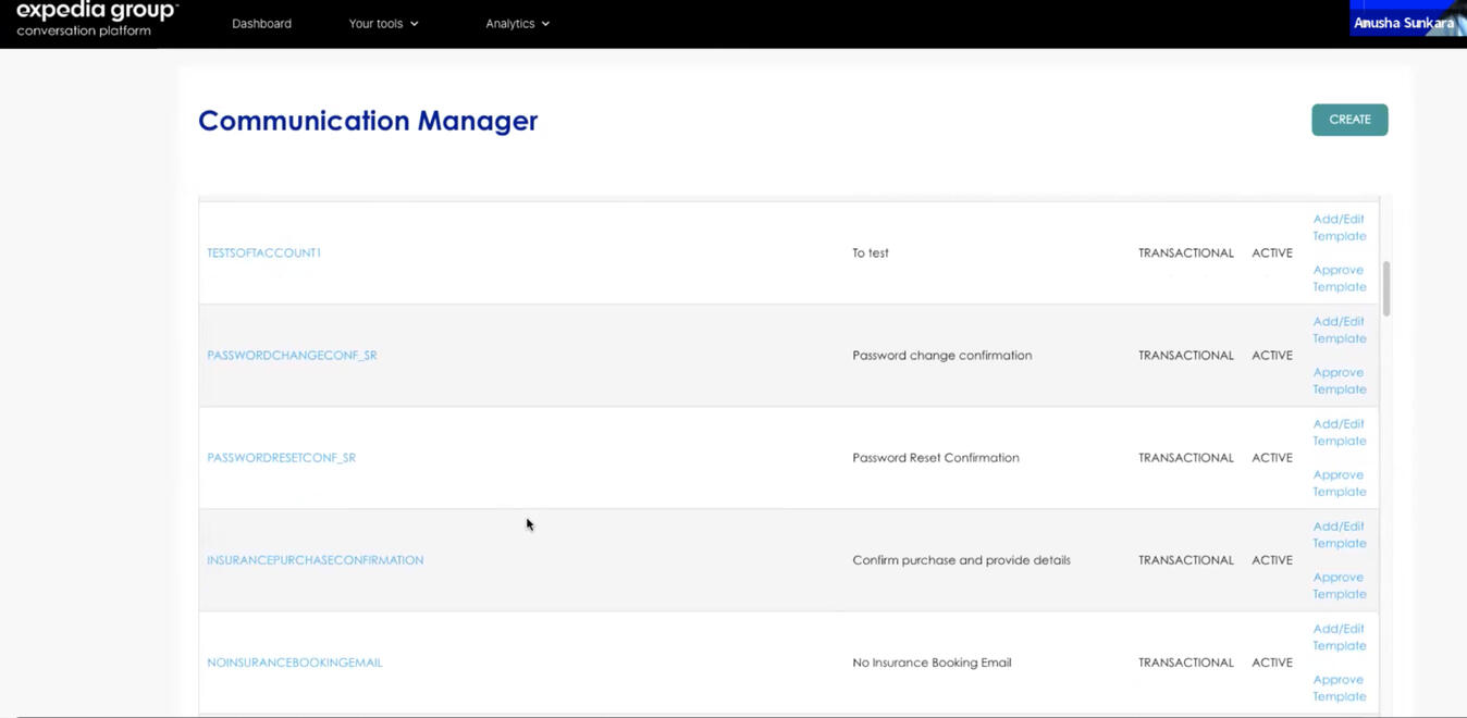
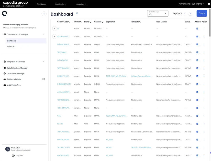
Myself and a design partner were asked to do a complete visual overhaul of an internal content management system that marketing folks used to send out content. We were on a tight timeline and the architecture of the system had already been determined by an engineering team. Product asked us to design it to help authors send out multiple instances of a “communication” across different channels at the same time. Plus, we were planning to externalize the platform and needed to align with broader industry mental models.
As we started looking at the system and talking to internal users, I noticed a consistent pain point: the architecture of a “communication” confused authors and made it difficult to design a front-end without showing the complexity of the backend.
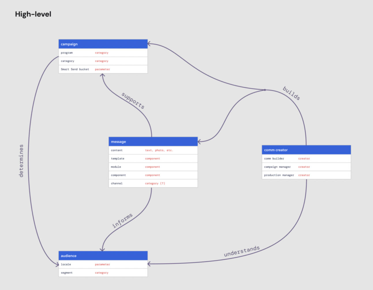
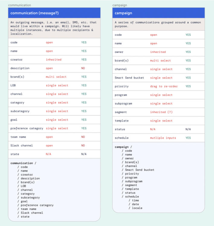
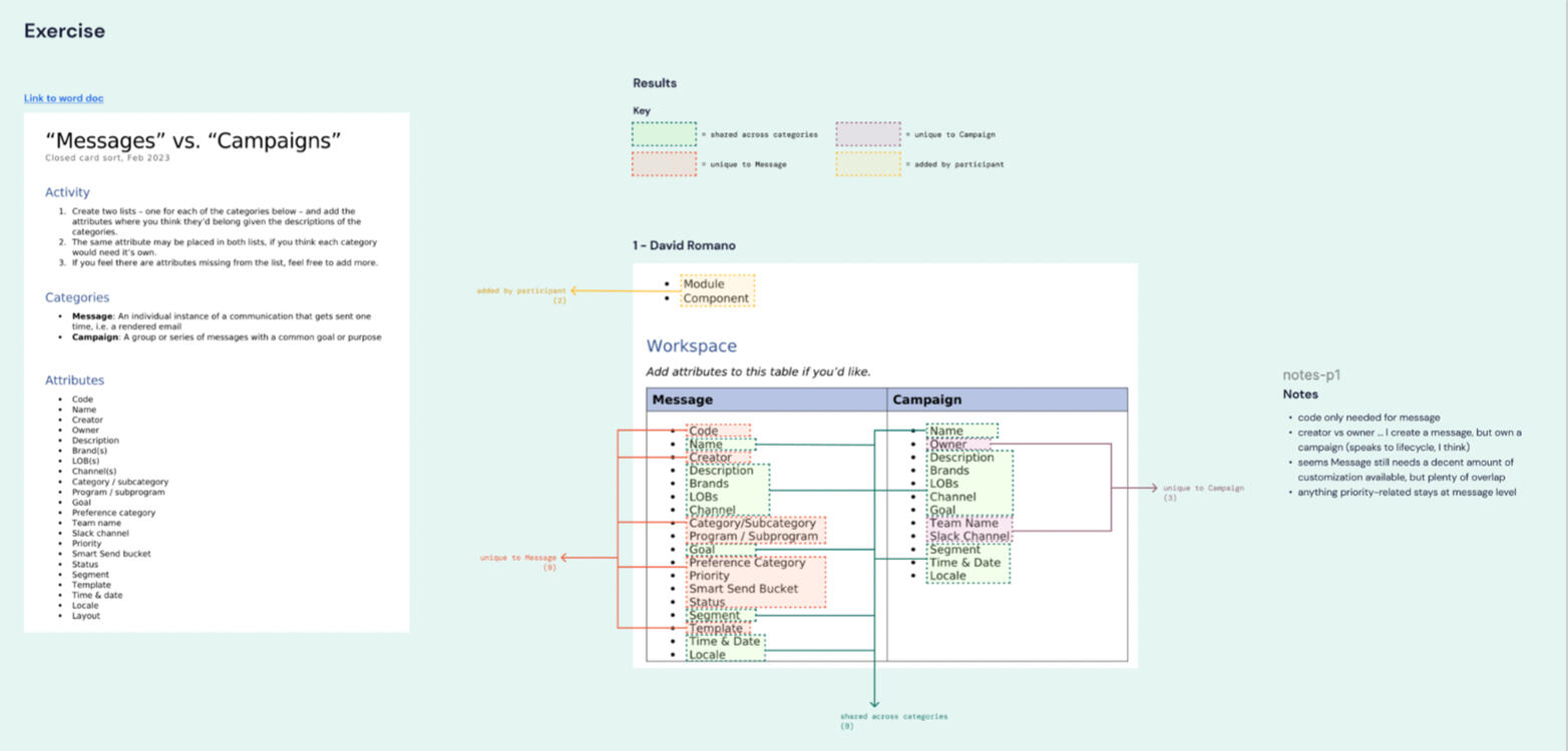
My focus shifted from UI content to “concept mapping,” where I organized the existing objects in the system and tied them to their attributes to identify areas of improvement. From this, I proposed an additional layer of organization above “communication” that we called a “campaign,” which would allow folks to organize their messaging in a way that made sense to them and reduced complexity in the system.
"Communication" vs. "Campaign" attribute mapping
From this change, I helped…
Make it ~30% more efficient to create multiple instances of a single campaign, which compounds with each instance I create (7 attributes out of a total 24 shared by the two layers moved to encompass each campaign)
Align with users’ mental models & planning methods
Align and simplify previously incongruous terminology to reduce miscommunication
Create an architecture that would scale to meet the needs of product plans
Enable a number of delightful UI enhancements that wouldn’t have been possible if we’d had to represent the complexity of the old architecture
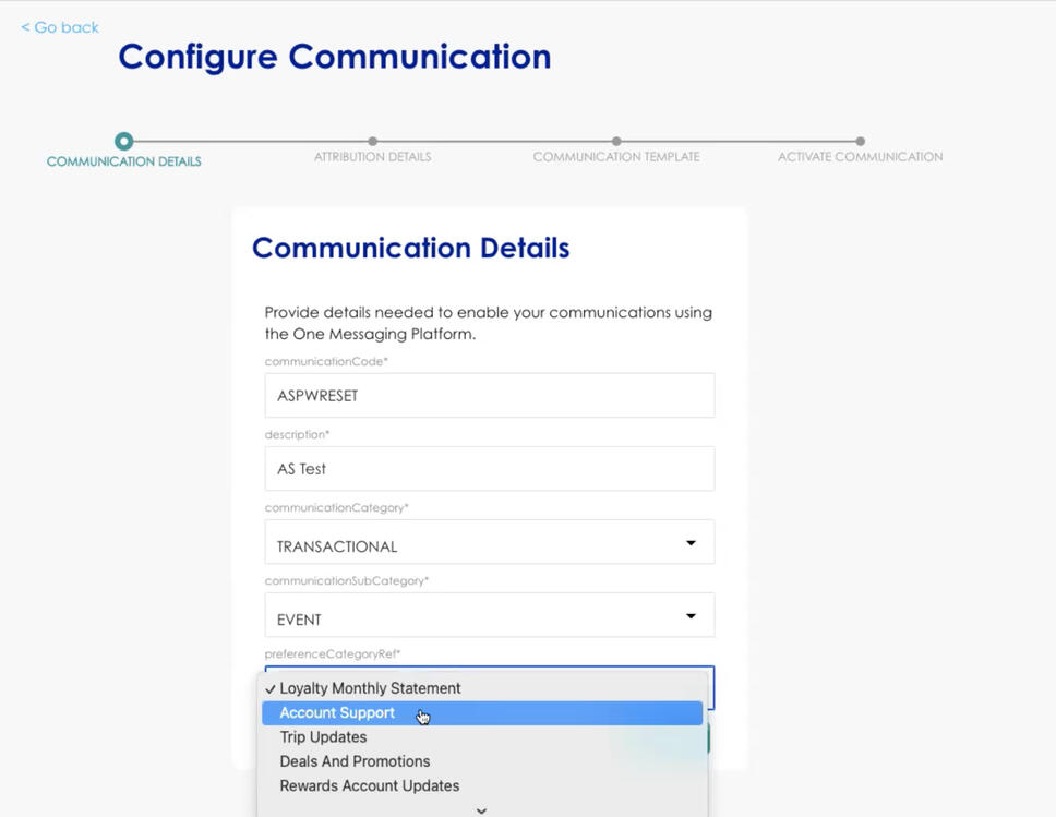
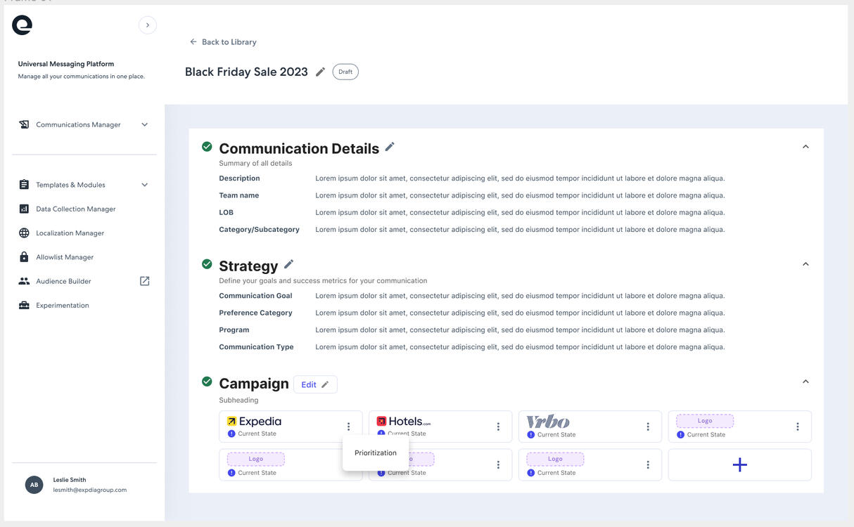
Campaign creation: before & after
Communications library: before & after
Assuring users of backend progress
Expedia Group / 2020
While building out an early version of Expedia Group’s proprietary chat platform, we encountered an issue with the loading state for new messages: when a “skill” (virtual agent task) took more than a few seconds, it appeared frozen. We knew this happened consistently for a couple of our more complex skills that required a number of checks on the backend.
We were asked to come up with a design solution for it. The designers I worked with initially came up with a couple solutions that modernized the indicator from a visual standpoint, but still didn’t do much to infer that work was continuing to happen behind the scenes. I thought it’d be a good opportunity to use content to solve a problem.
Where we had presented background updates as “system” messages from the user’s perspective, I proposed we use the updated visual treatment for loading messages to contain rotating content that could be customized for different scenarios. By sending these updates from the perspective of the virtual agent, we built empathy for it and trust in its ability to complete tasks.
After validating with research, we also determined that it…
Increased user assurance (& therefore retention)
Was a marketable addition to partners using our component library
Scaled across brands and use cases, given its customizability
Enabled higher self-service, as folks remained dedicated to completing flows
Increased accessibility when used, as screen reader users received announcements of progress
Systematizing confirmation email content
Expedia Group / 2024
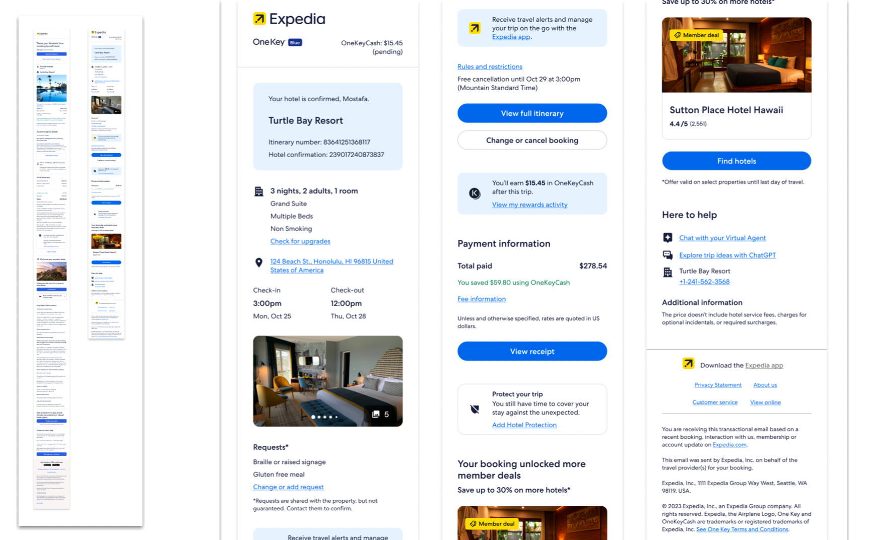
While working in the “Communications” product area at Expedia Group, I joined a project whose goal was to improve & systematize confirmation emails. These are the ones you get when you’ve made a booking; we wanted to create a structure that would flex across all product verticals and allow space for dynamic information while preserving the position of core information throughout.
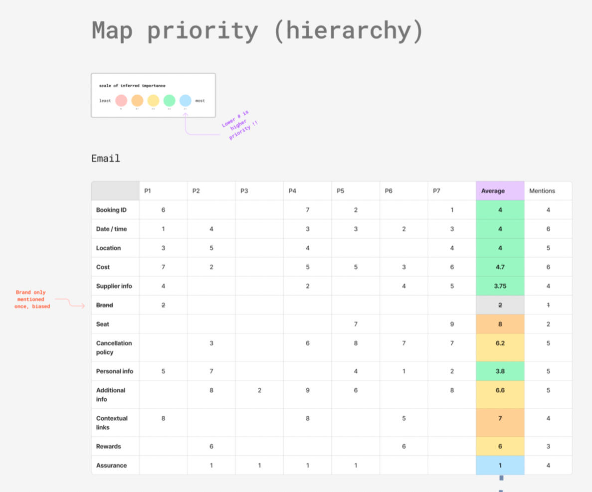
The design team was a bit bloated and we were still forming partnerships across product and engineering. I quickly determined that I’d be most impactful by focusing on the core information hierarchy. It had been awhile since anyone had validated the order and importance of information we’d been sending folks. An additional ask from our product partners was to significantly shorten the length of emails while adding space for marketing content.
I first conducted a round of internal testing where the working group all did an activity adjacent to affinity mapping to determine what we all found most important in emails of the sort. We then validated our findings with a round of external testing (with help from our research partners). While we didn’t get much clearer signal on the order of information, we gathered enough helpful comments to determine that our internal activity had landed close to general sentiment.
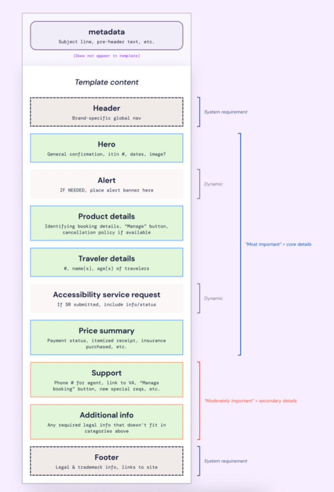
From there, I created a systematized layout of product-agnostic blocks of information with guidance on dynamic content, plus I provided specific guidance for marketing guidance and tone of voice.
My work contributed to a default template that…
Clearly defined & ordered core information
Shortened the base template by ~40%
Scaled across lines of business
Allowed for easy slotting of dynamic blocks of information
Kicked off a larger systematization effort
Put accessibility on the front foot for future designs
